
ServiceS
Signage design + Logo design + Visual identity + Brand guidelines + Print design + Environmental graphics + Art direction
Signage design + Logo design + Visual identity + Brand guidelines + Print design + Environmental graphics + Art direction
Context:
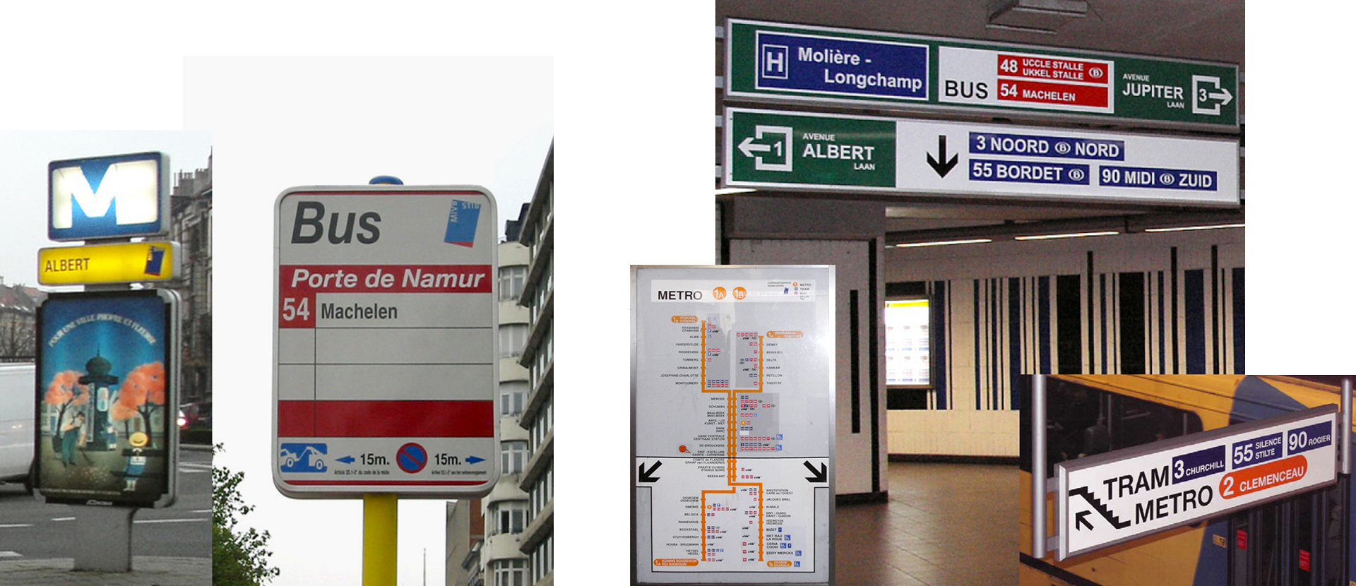
For years, too much people worked in silos, which has given way to several interpretations, creating different codifications systems, on the above-ground and underground.

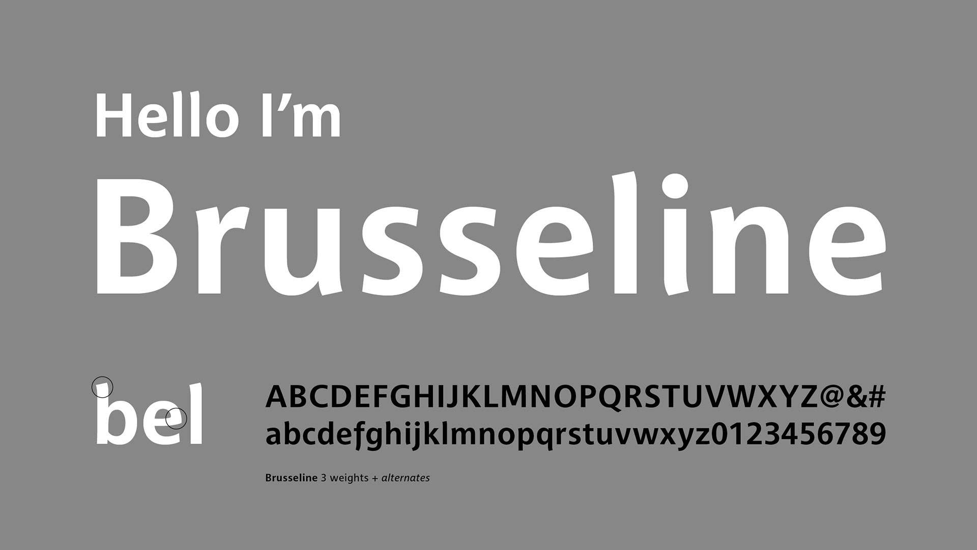
In the process, a custom typeface was specially designed with an Art Deco spirit, the Brusseline.
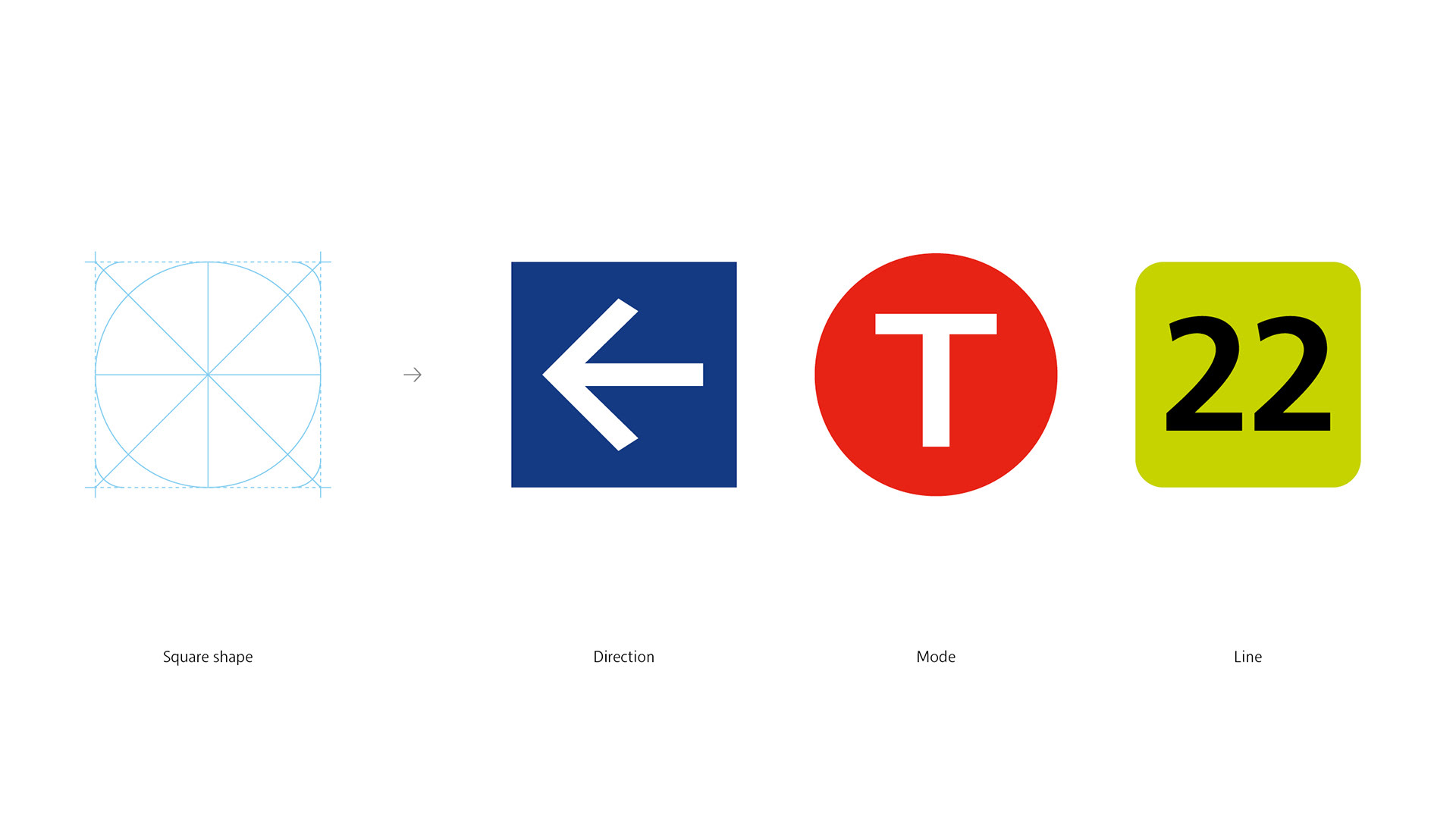
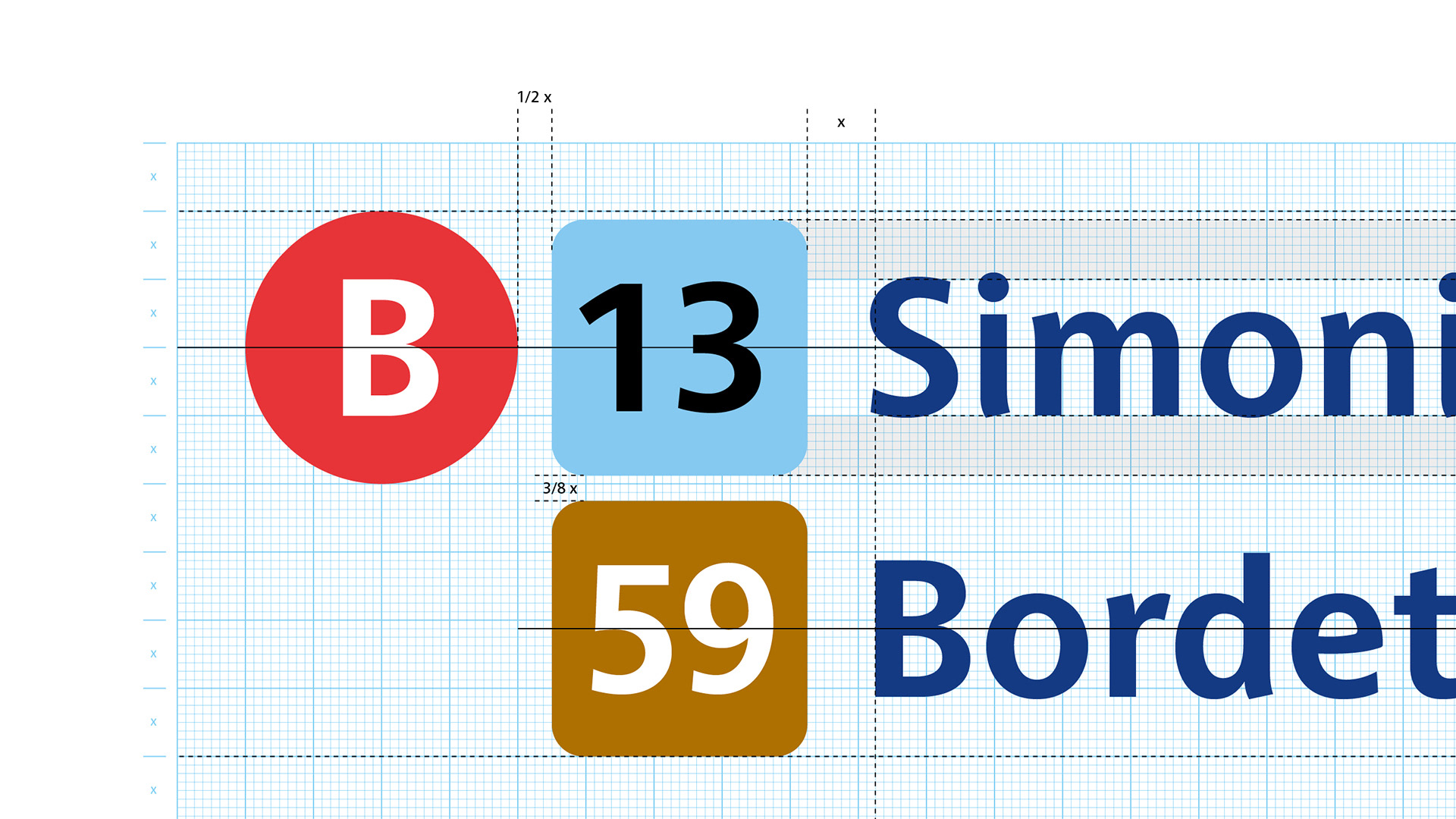
The huge amount of information, imposed that each graphic element needed to be perfectly designed.


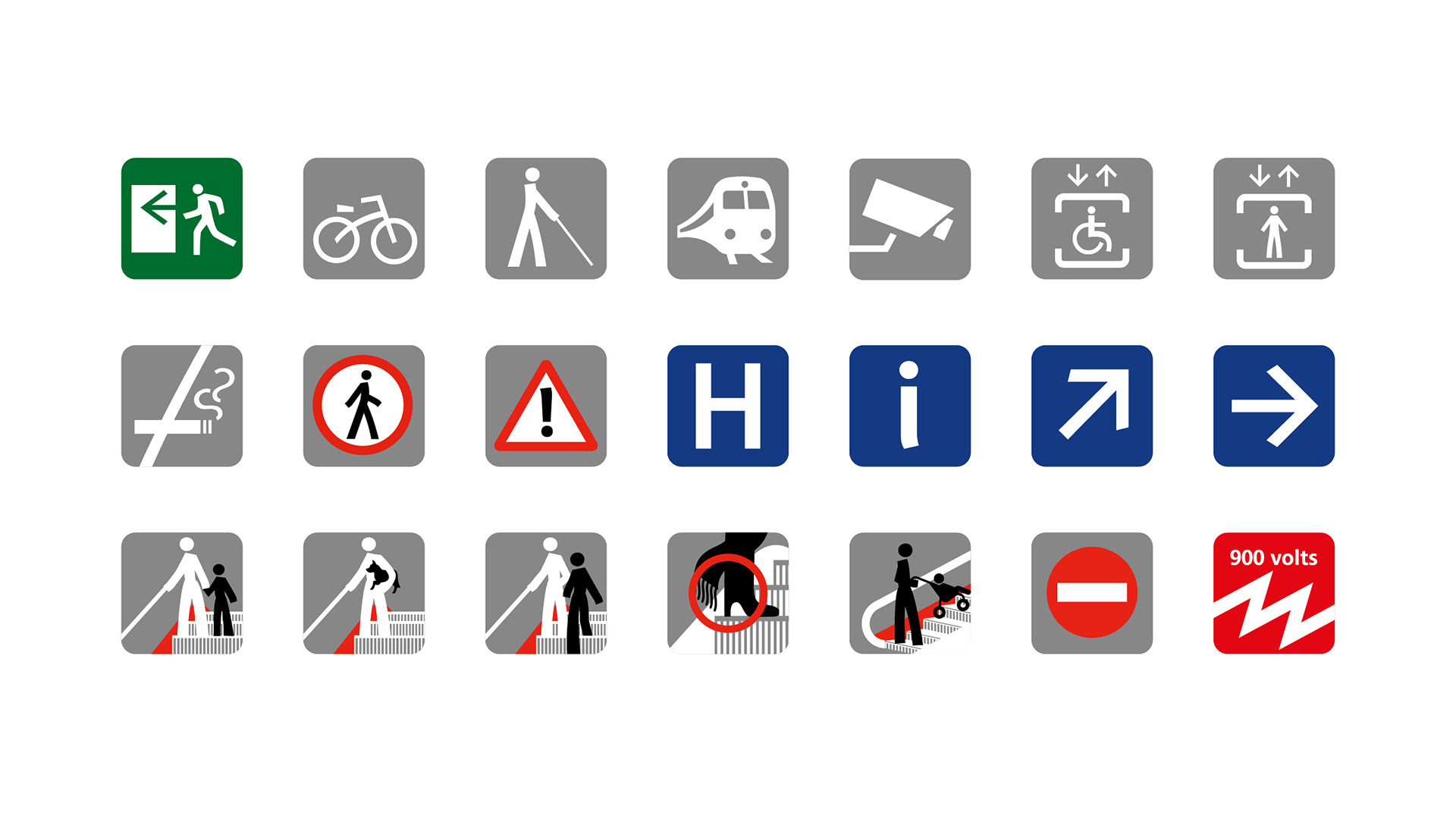
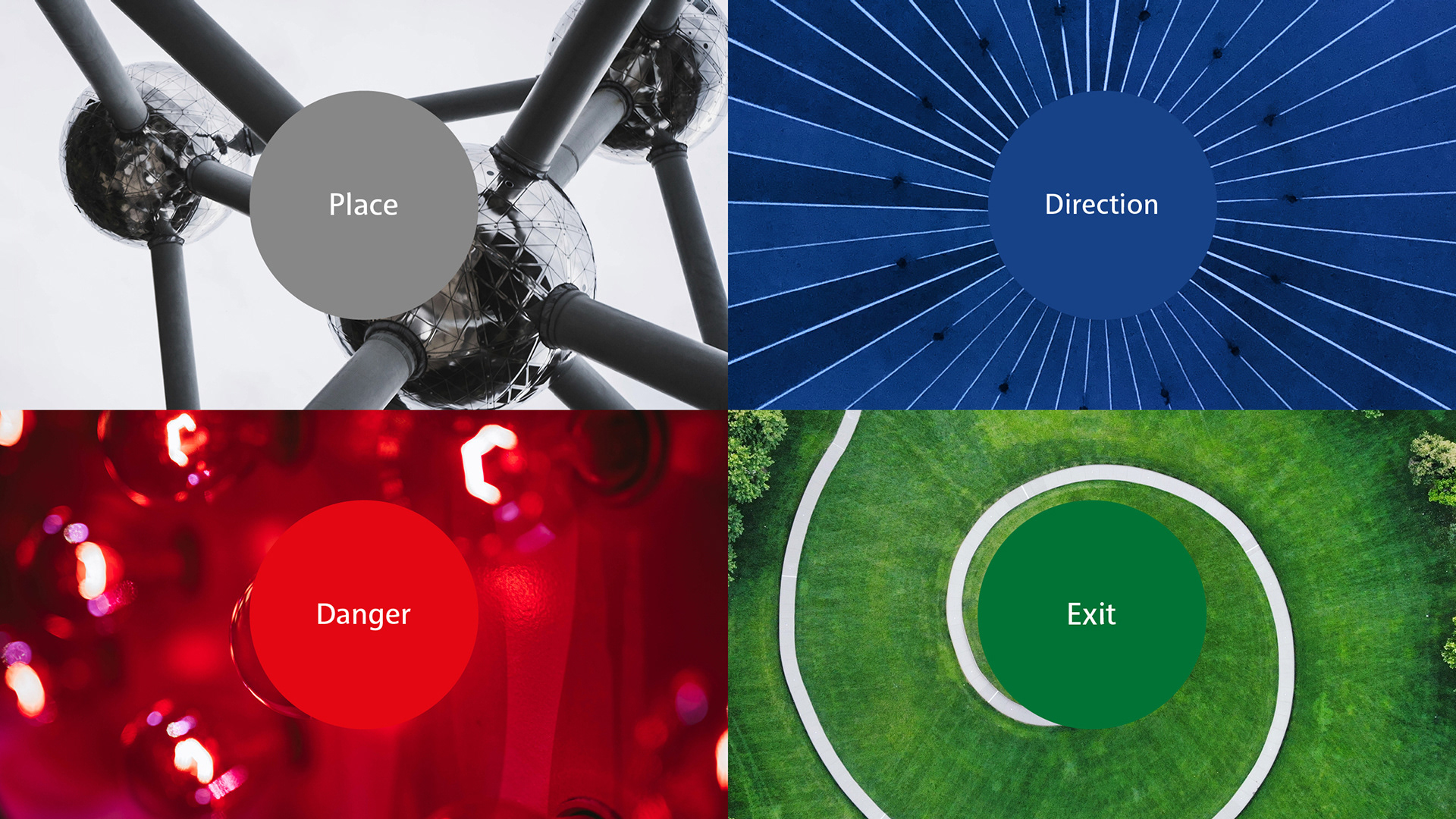
The information icons are an extension of the typography.
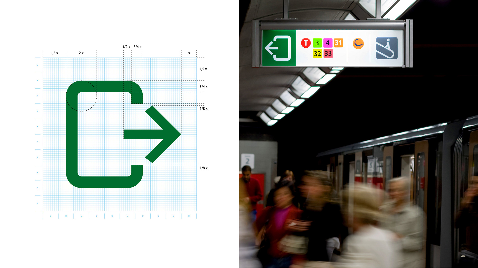

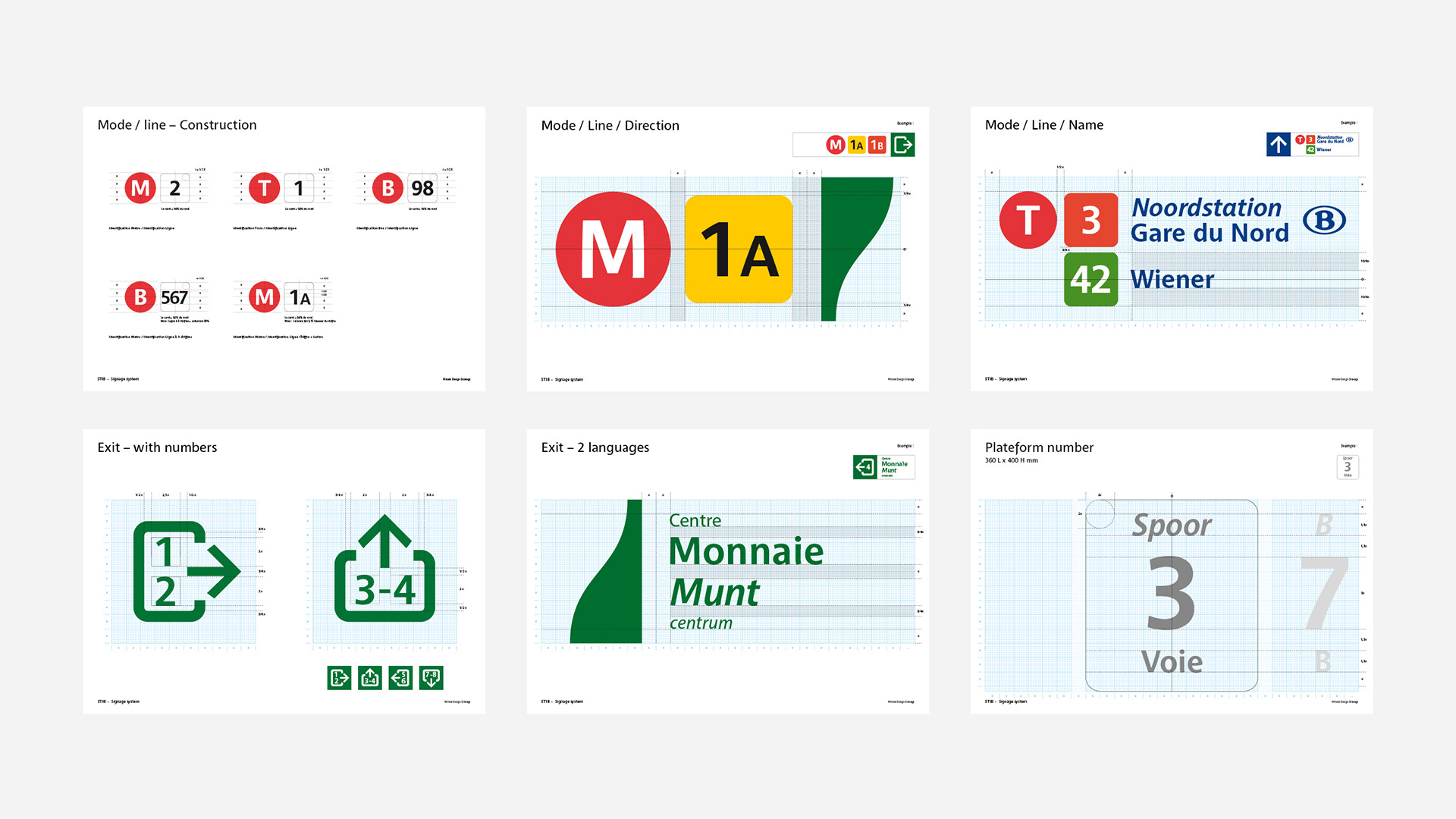
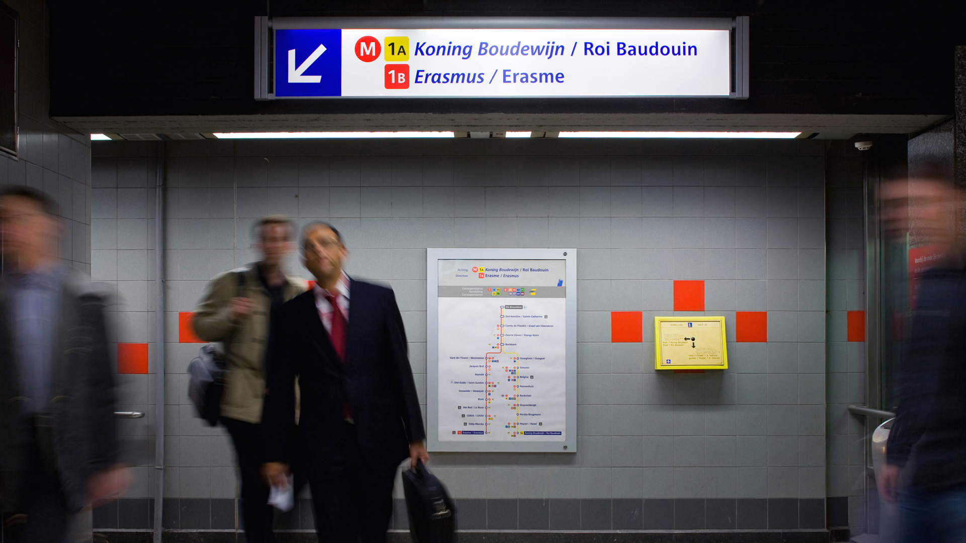
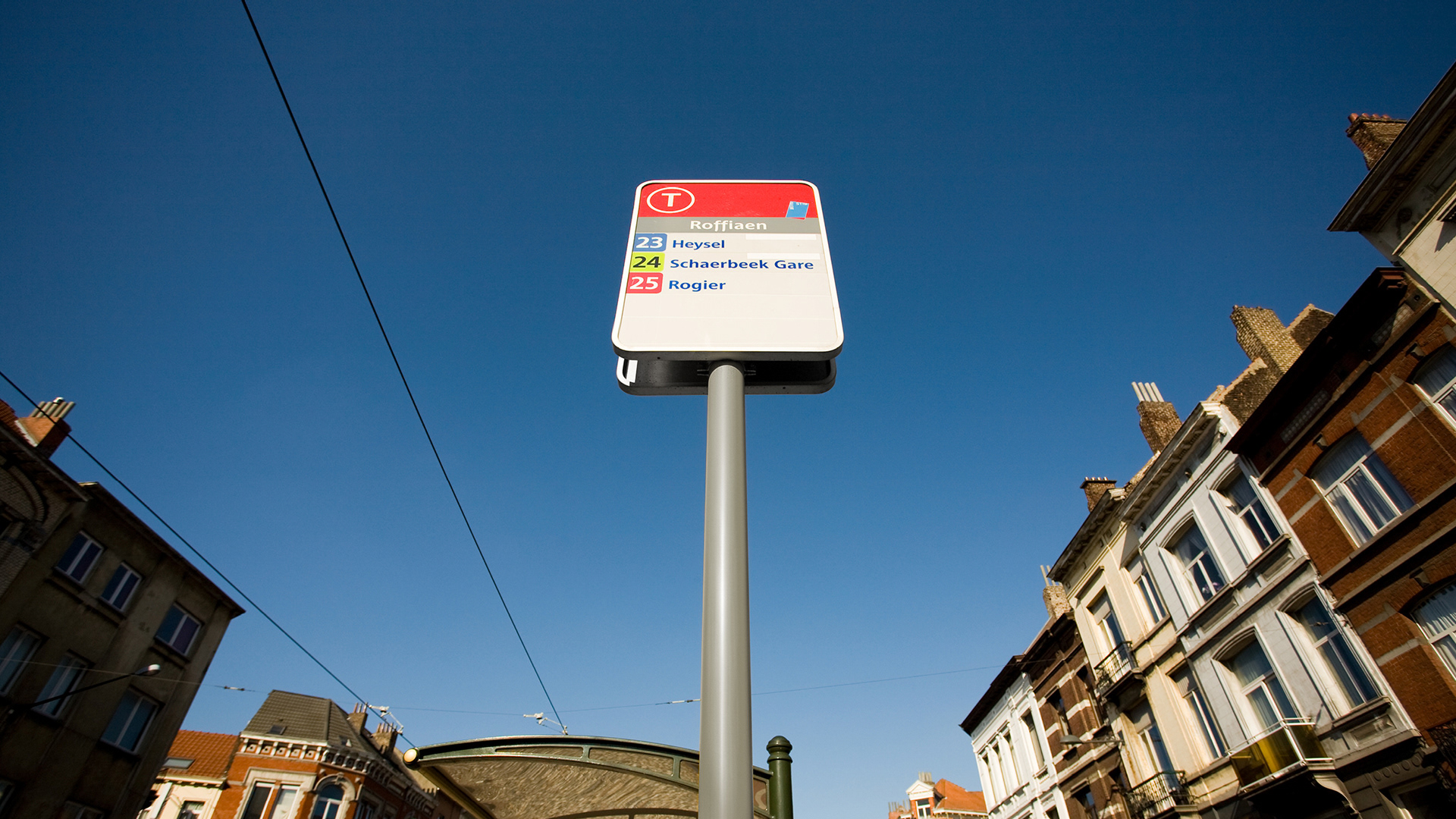
The signs structure and location had to remain the same as the one already in used.
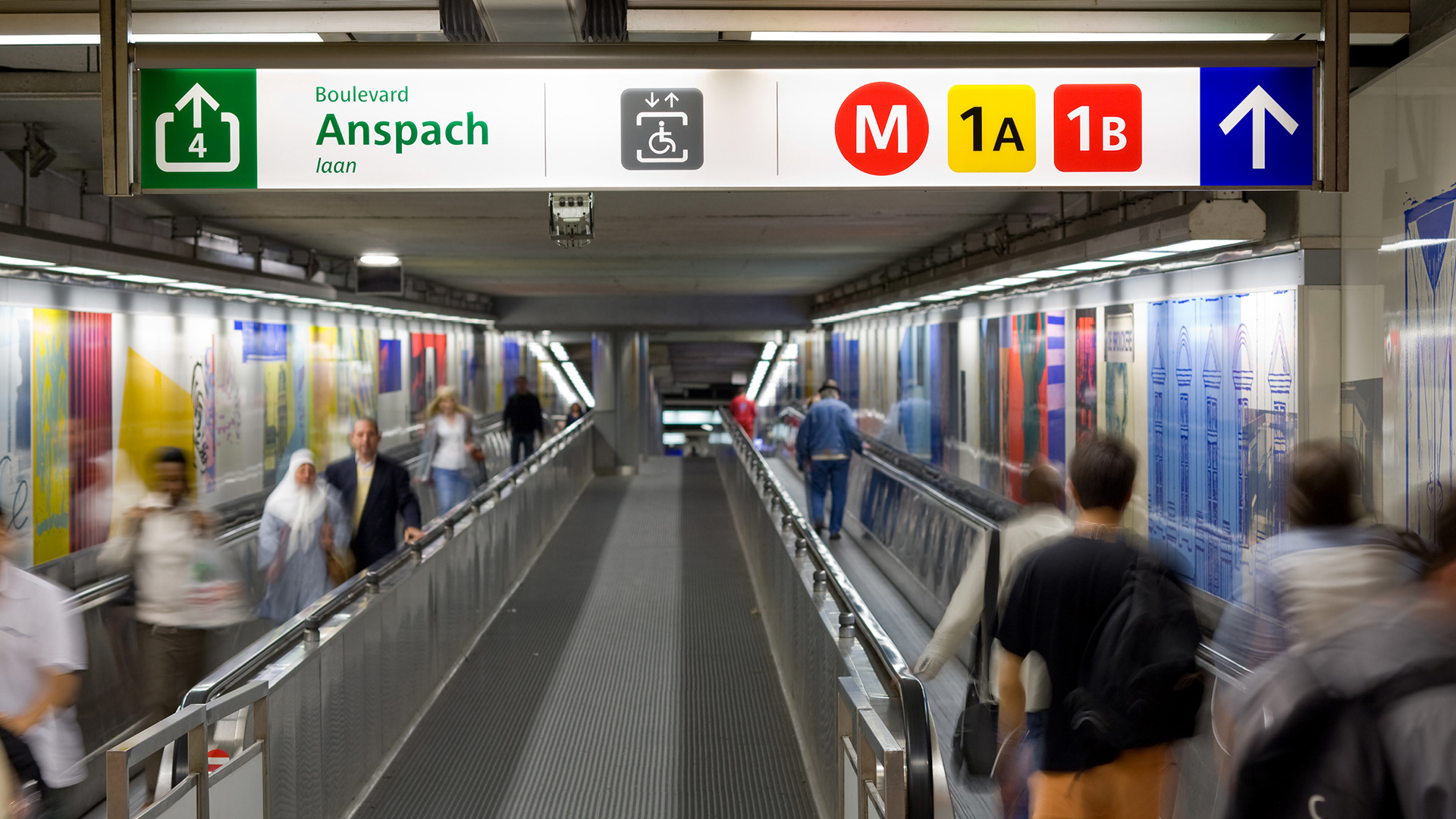

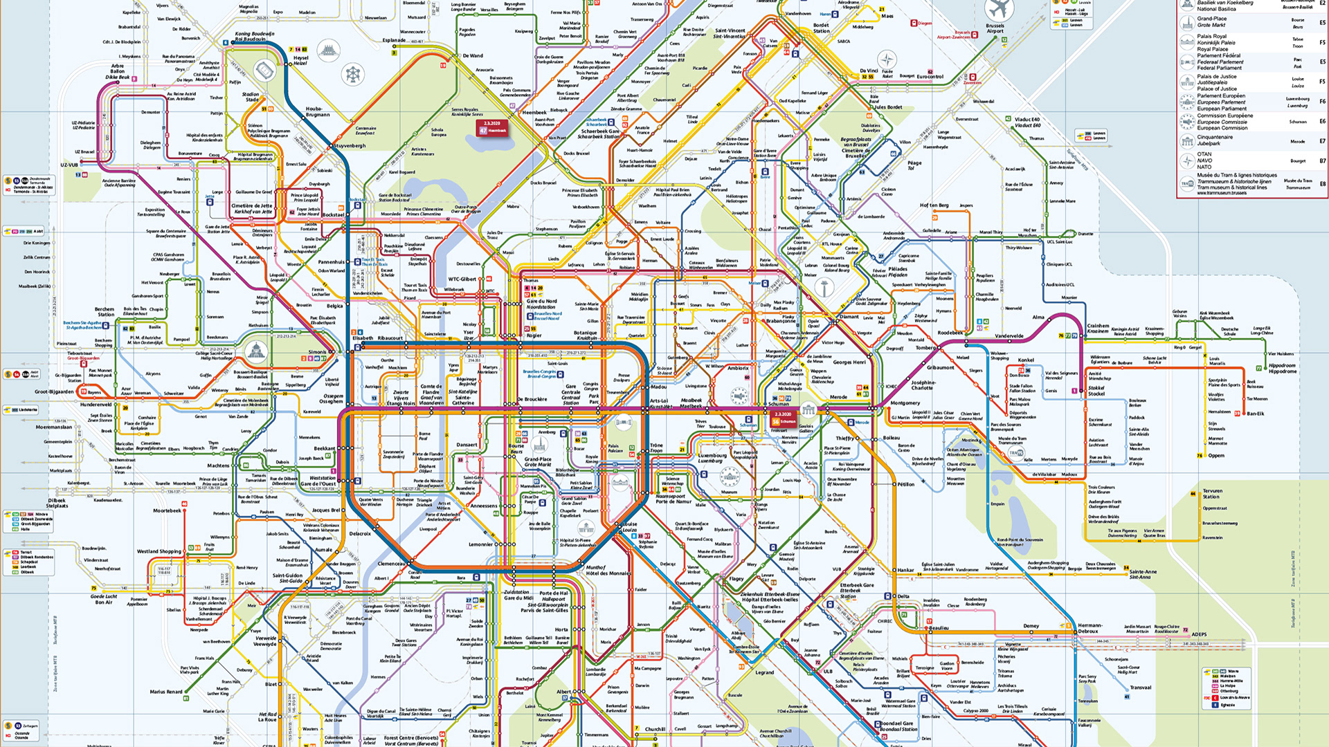
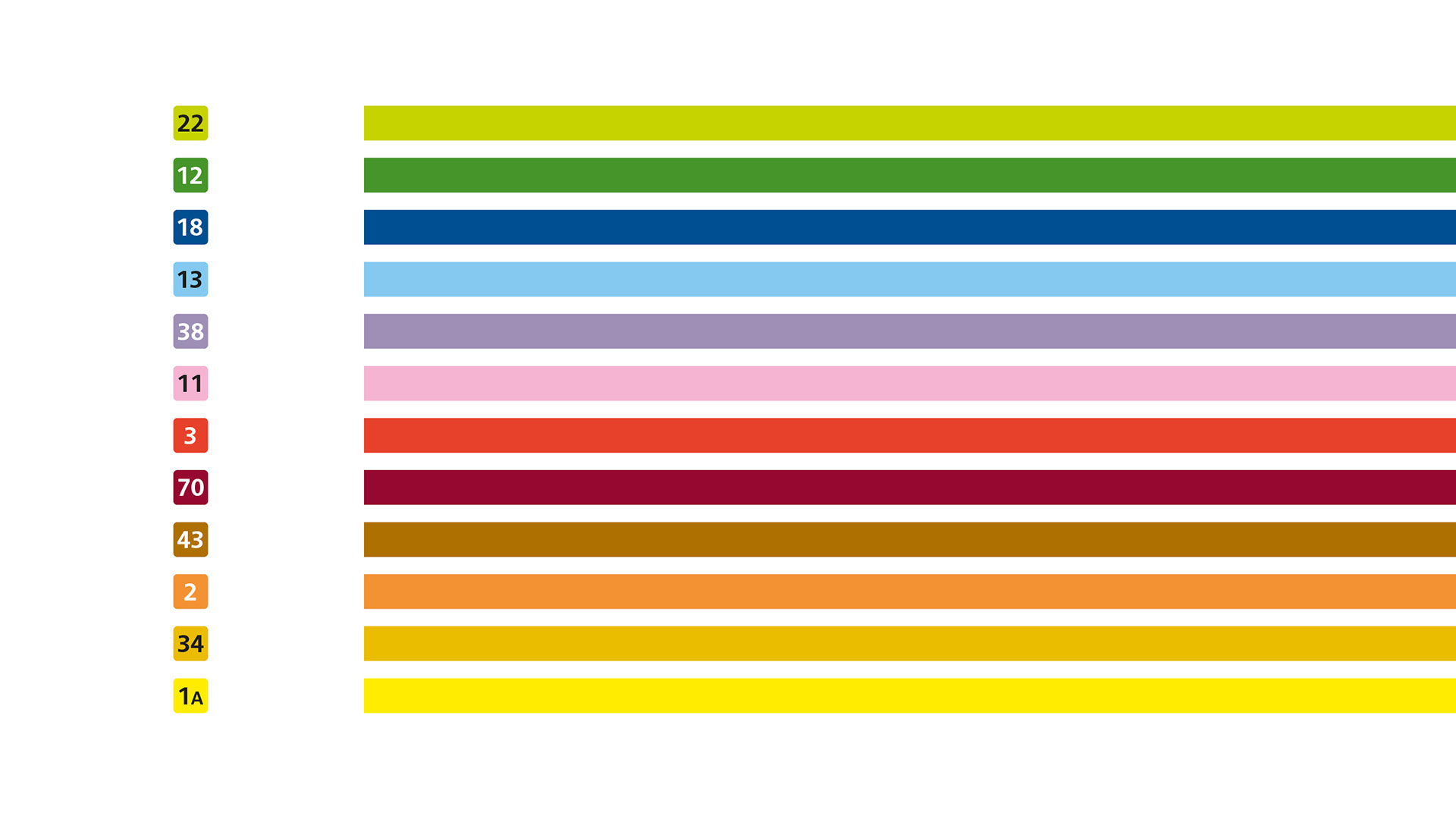
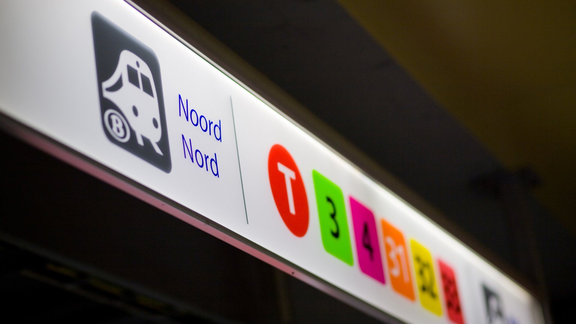
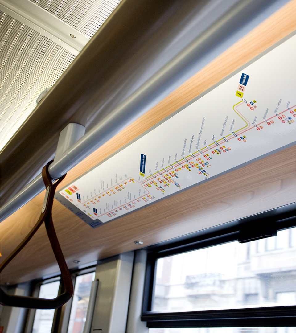
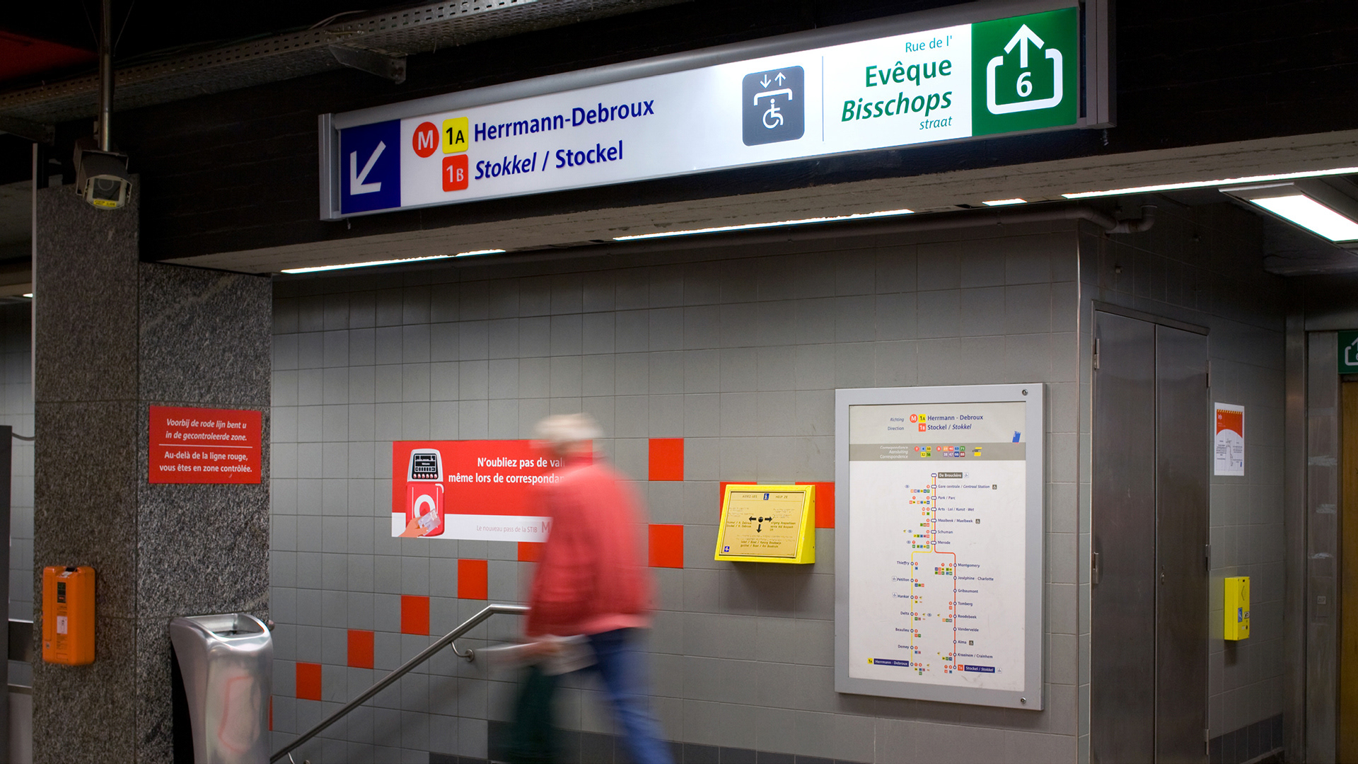
The wayfinding signage have been installed in all of Brussels’stations. Above-ground and underground.
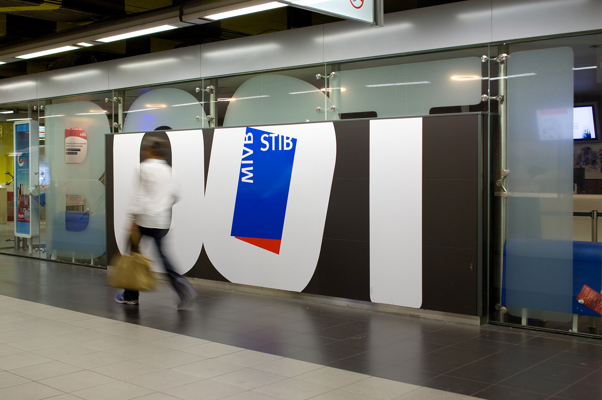
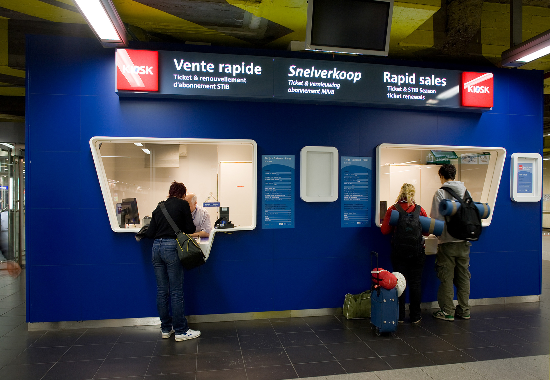
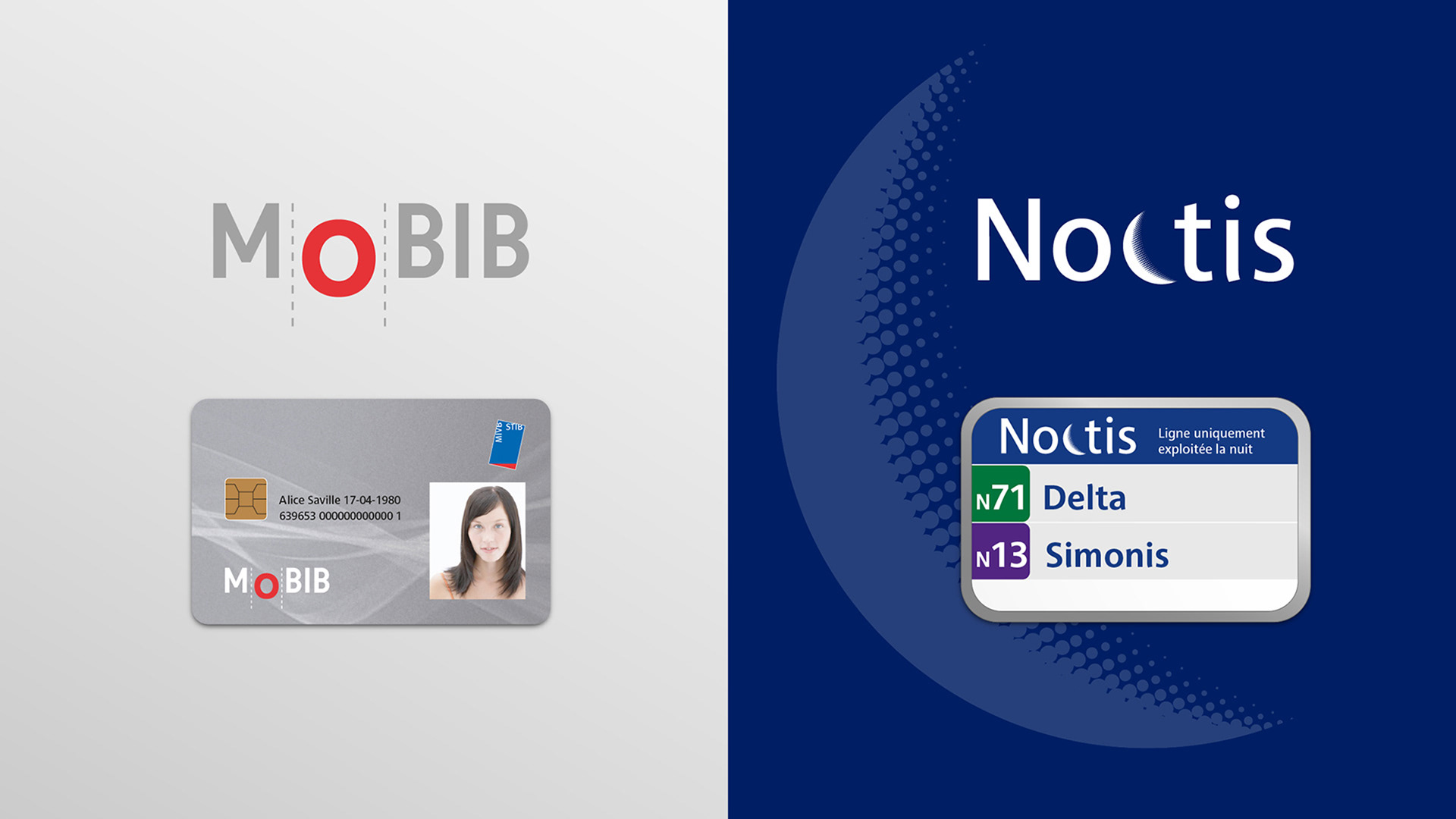
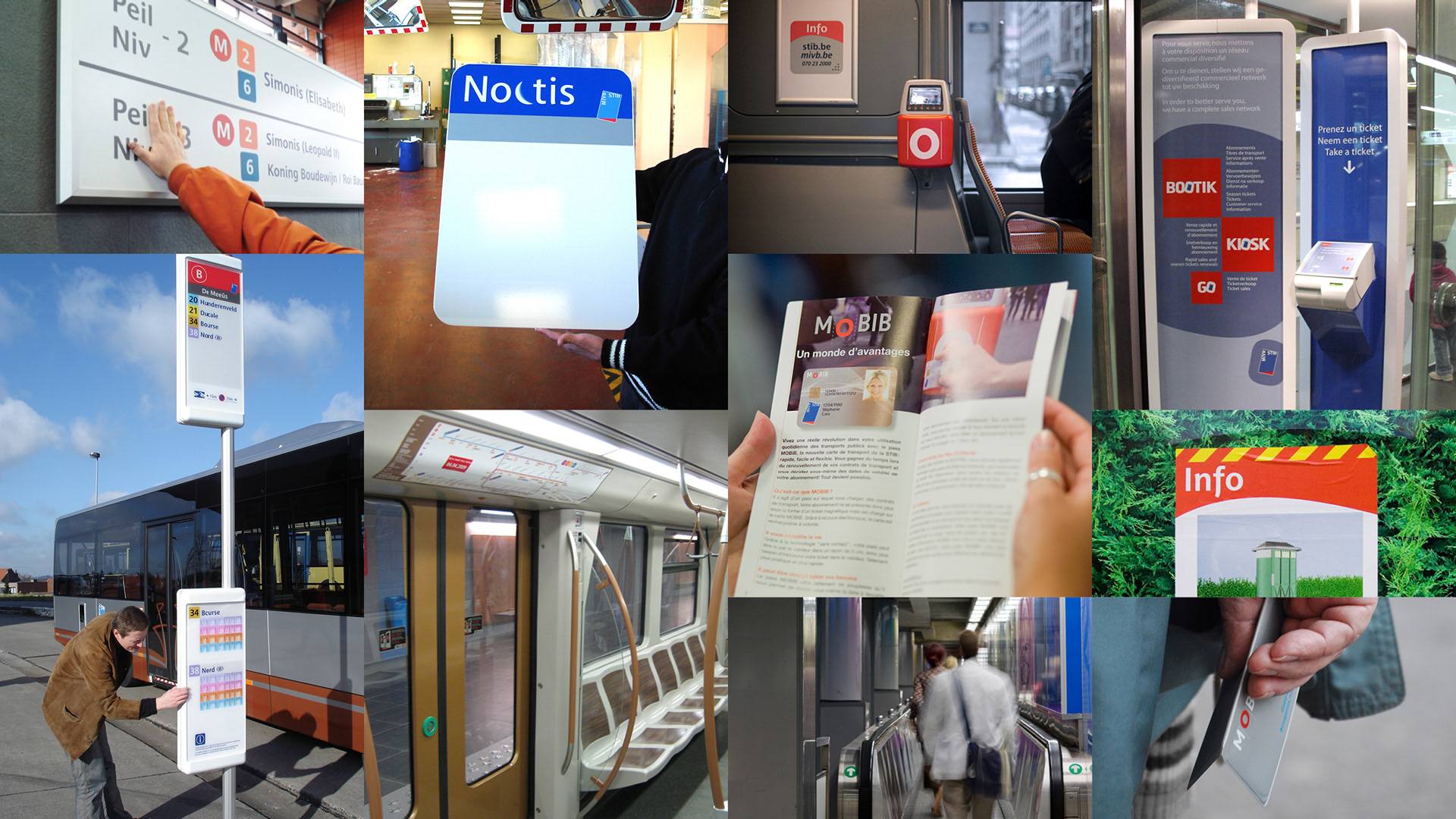
To enable a uniform experience across the entire customer journey, point of sale interfaces such as Bootik, Kiosk and Go, night services Noctis logotype, Mobib travel card, and all the commercial and institutional brochures, where also designed in the process.

Re-thinking the signage for the public transport system of the capital of Europe was a major task. I joined a multidisciplinary team led by planning consultants, and composed of sociologist, signage technicians, industrial designer and typographer.
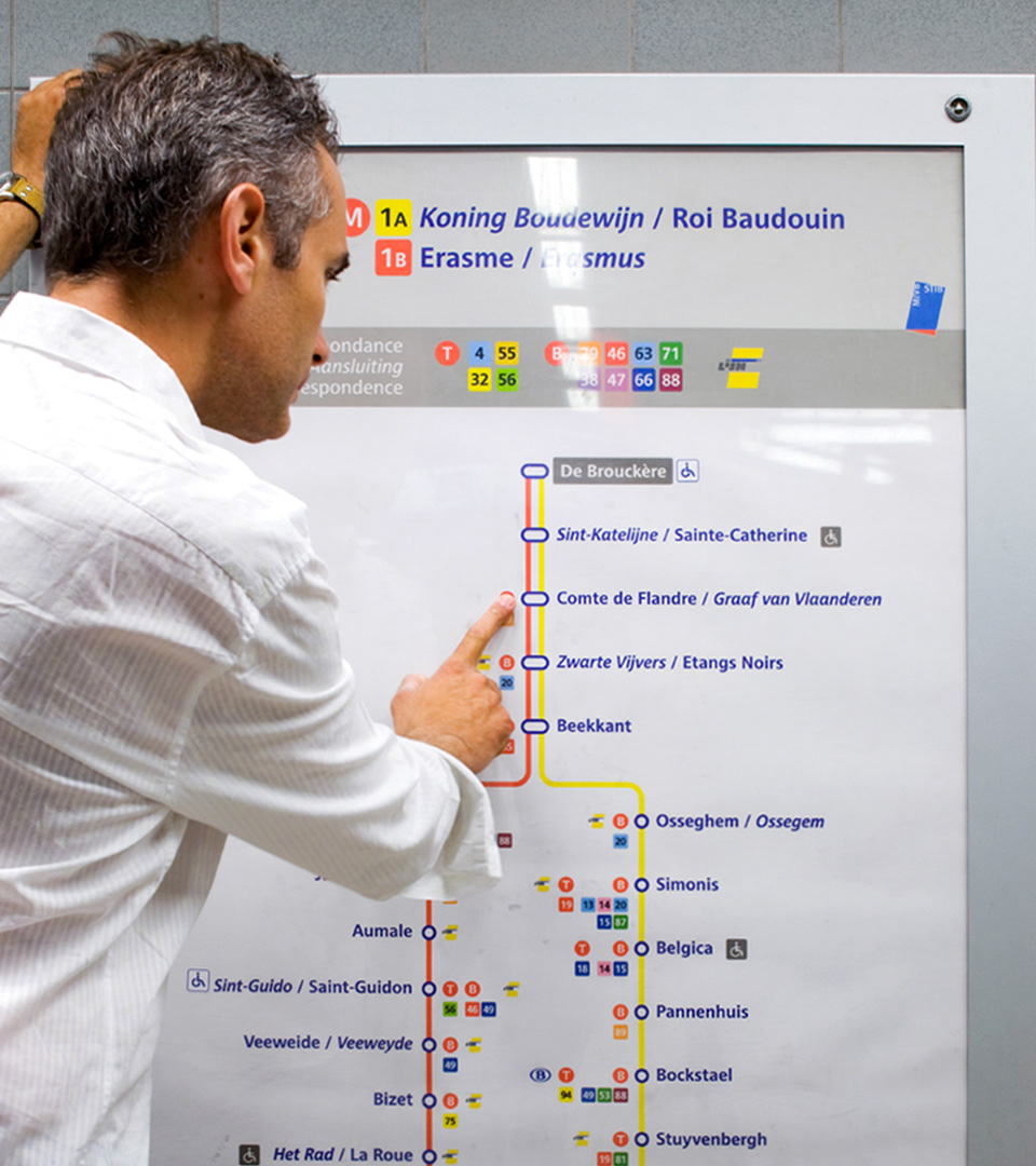
A study of travellers’ behaviour was conducted to understand how passengers find their way, and interact within the transport system.
Simplicity was the key. Wayfinding system, services, sales network design, publications... all have to come together to form a cohesive, clutter-free system that is easy for people to follow.
Simplicity was the key. Wayfinding system, services, sales network design, publications... all have to come together to form a cohesive, clutter-free system that is easy for people to follow.
Designed at Minale Design Strategy
Photos O. Seignette
Typography E. de Berranger
Photos O. Seignette
Typography E. de Berranger