
Services
Visual identity + Print and digital design + Environmental design + Art direction
Visual identity + Print and digital design + Environmental design + Art direction

Quick sketches from my notebook to find the graphic system family.
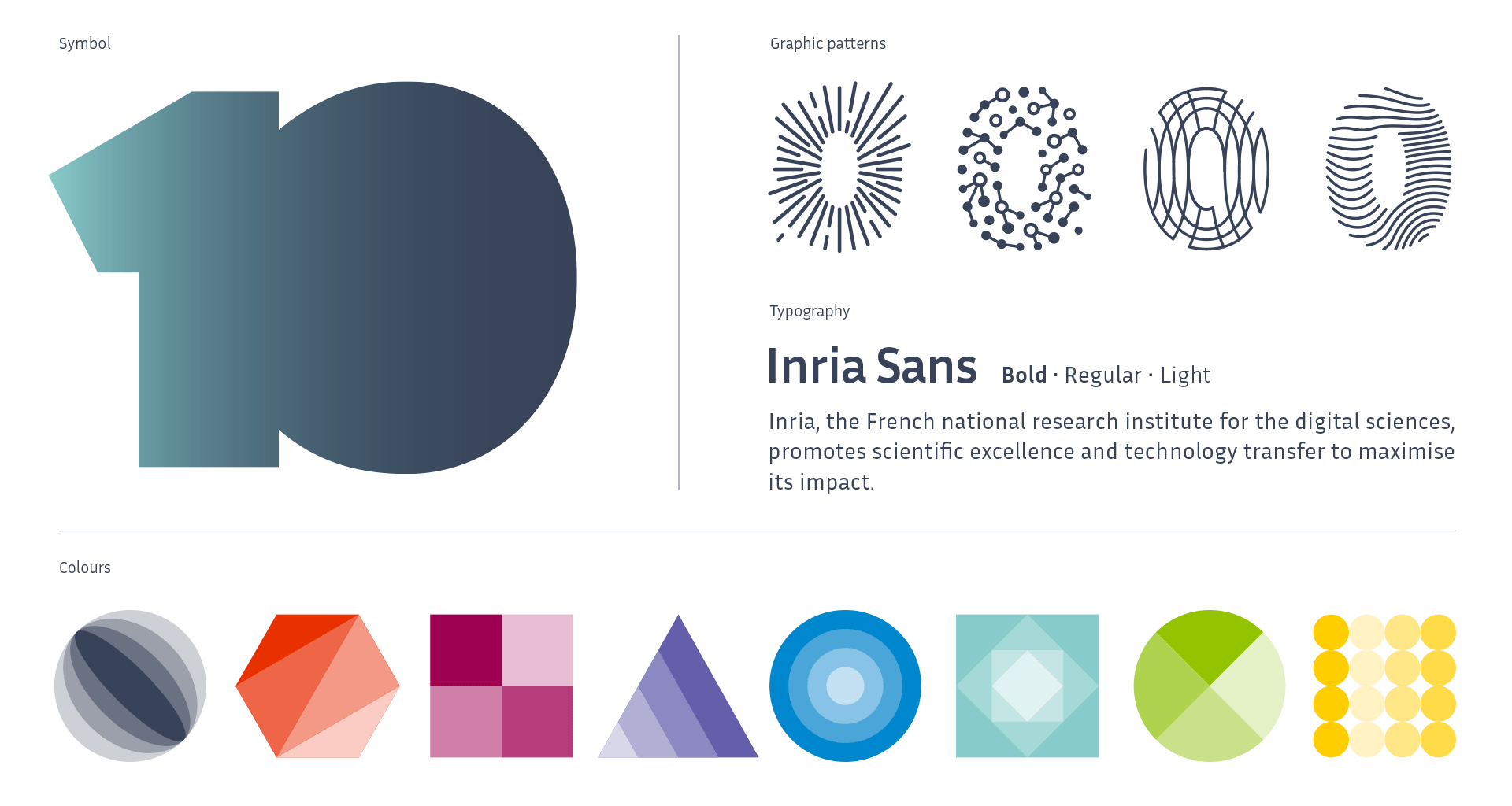
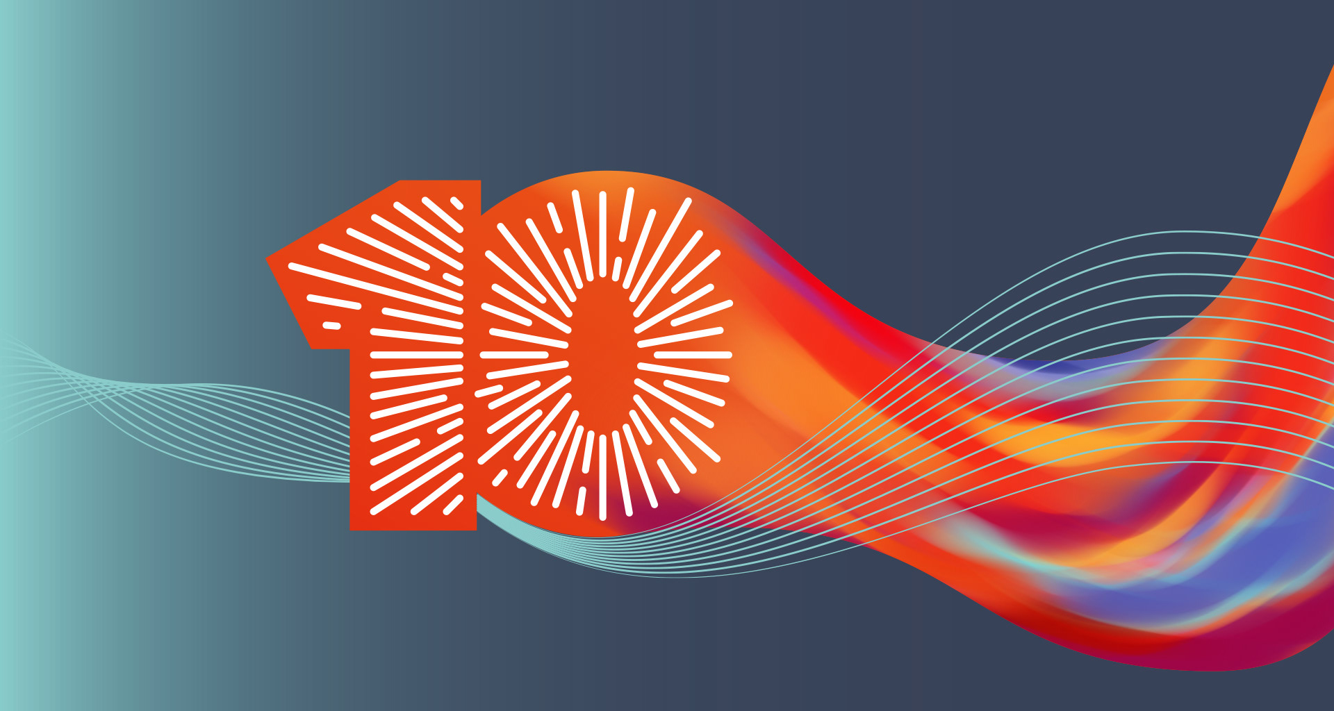
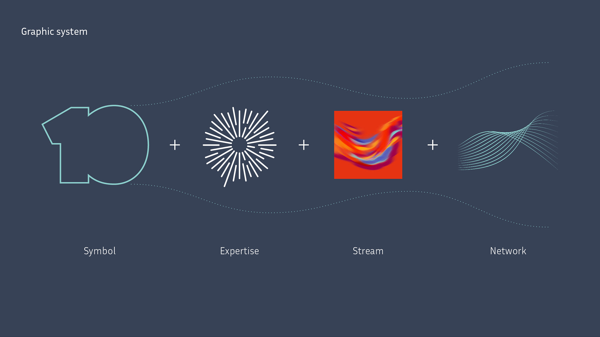
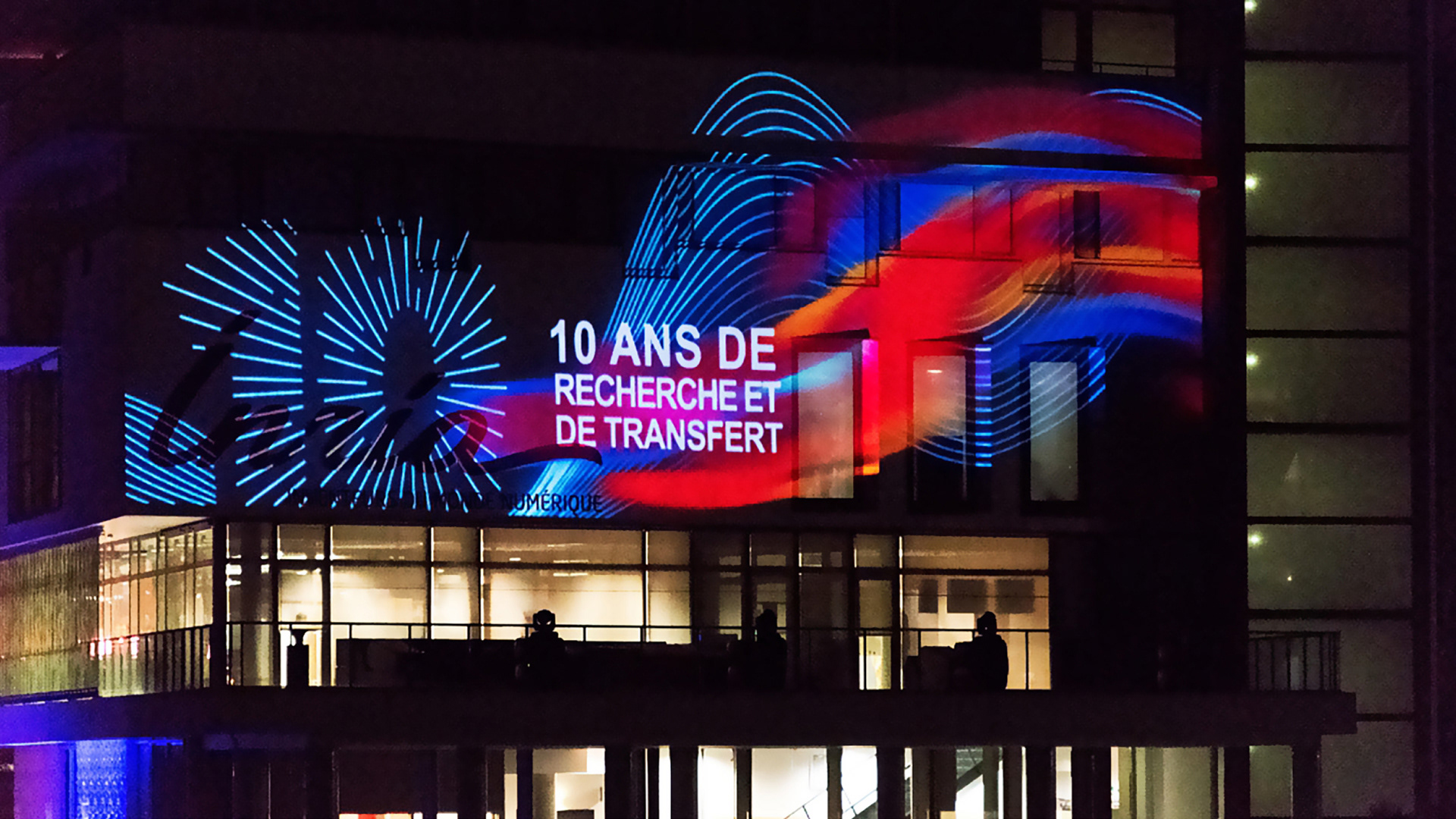
Based on the number ten symbol, the flexible and dynamic graphic system impulse elements to symbolise the different activities of the centres. Together, they spark, energize and flex to create the streams.
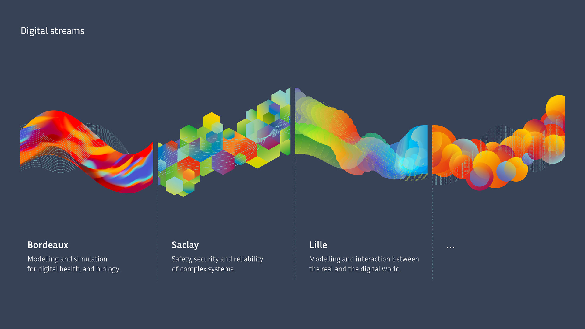
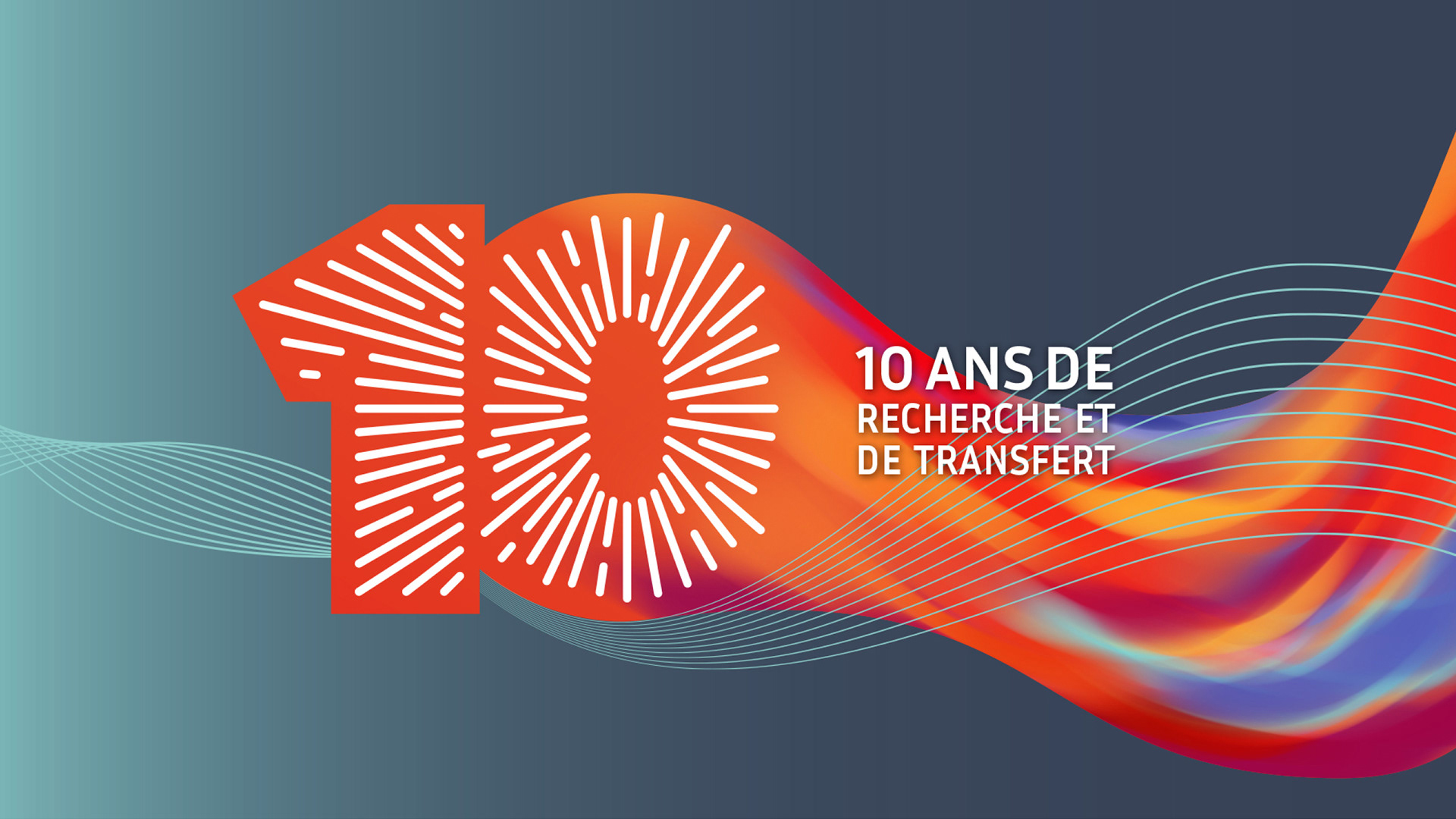

Bordeaux, Saclay, Lille... The vibrant digital-first identity tells the world that the brand stands for innovation, creativity and agility.
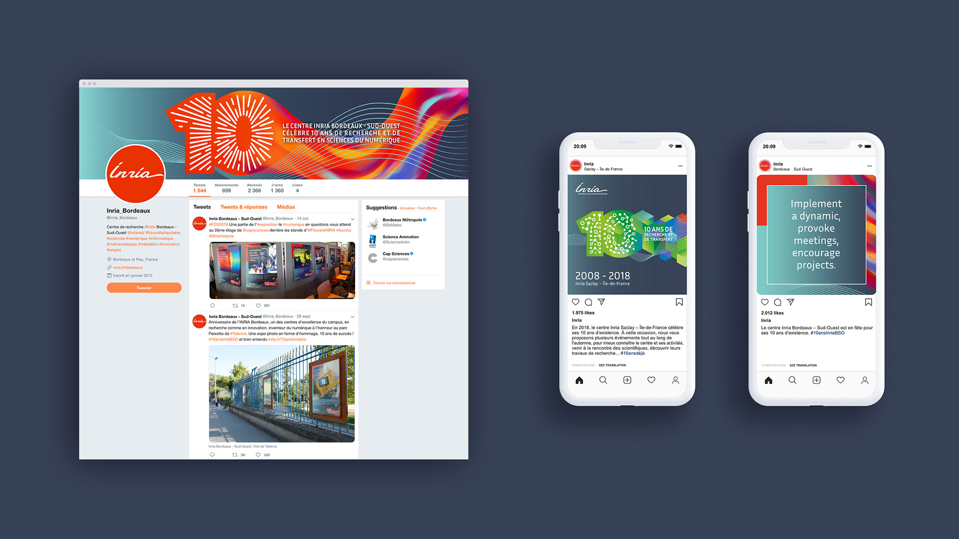
The strength of the logo allows it to stand alone on all types of communication supports, and easily flex on the Inria graphic system.

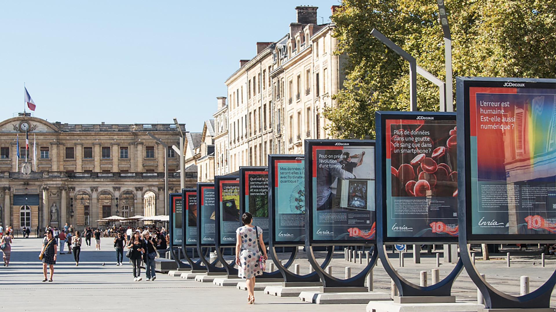
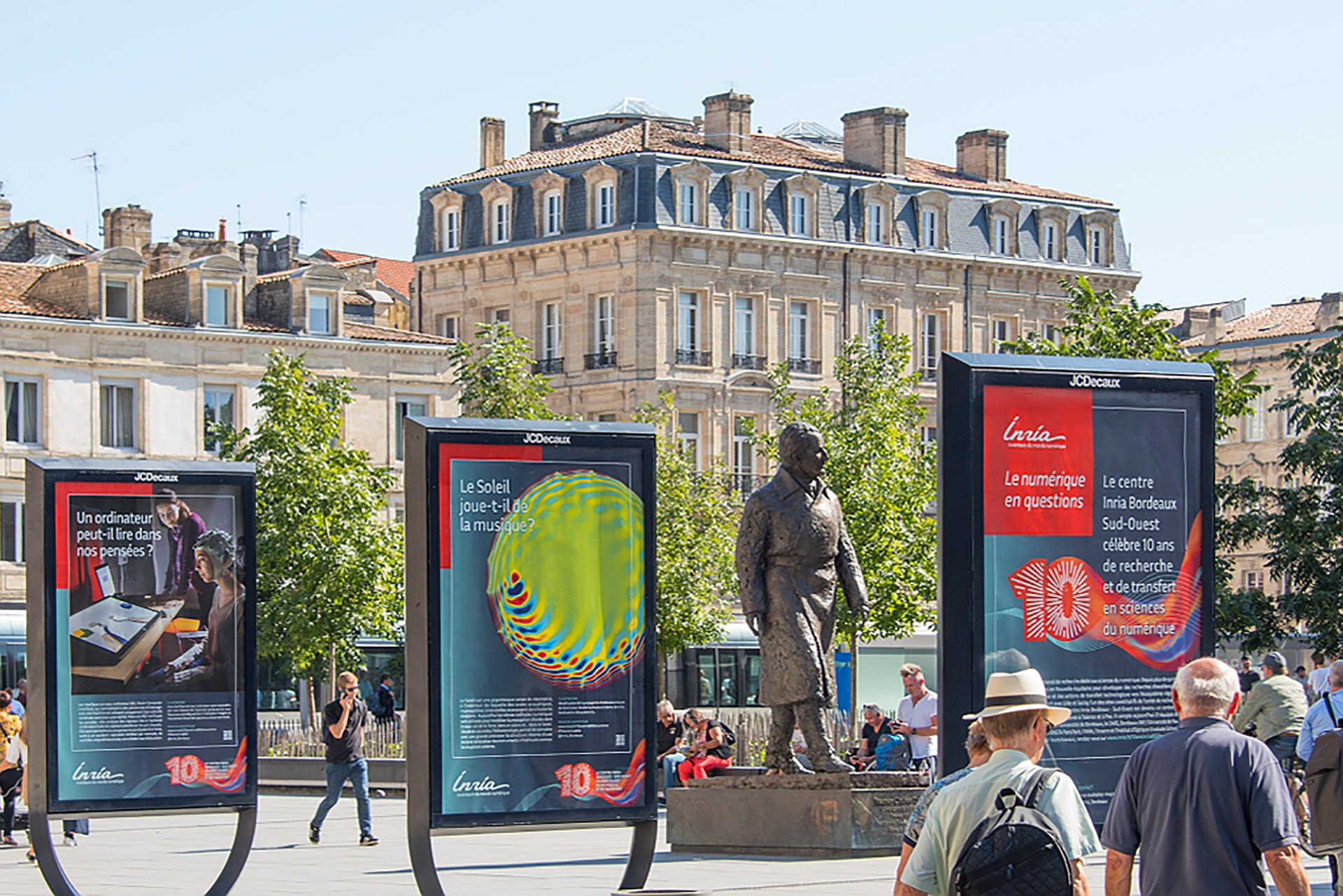
A posters series was also designed for an exhibition showcasing the place of digital science at the heart of our daily lives.
© Inria / Photos G. Scagnelli